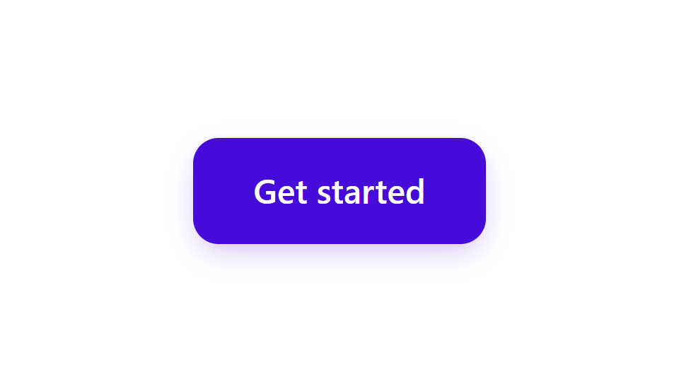
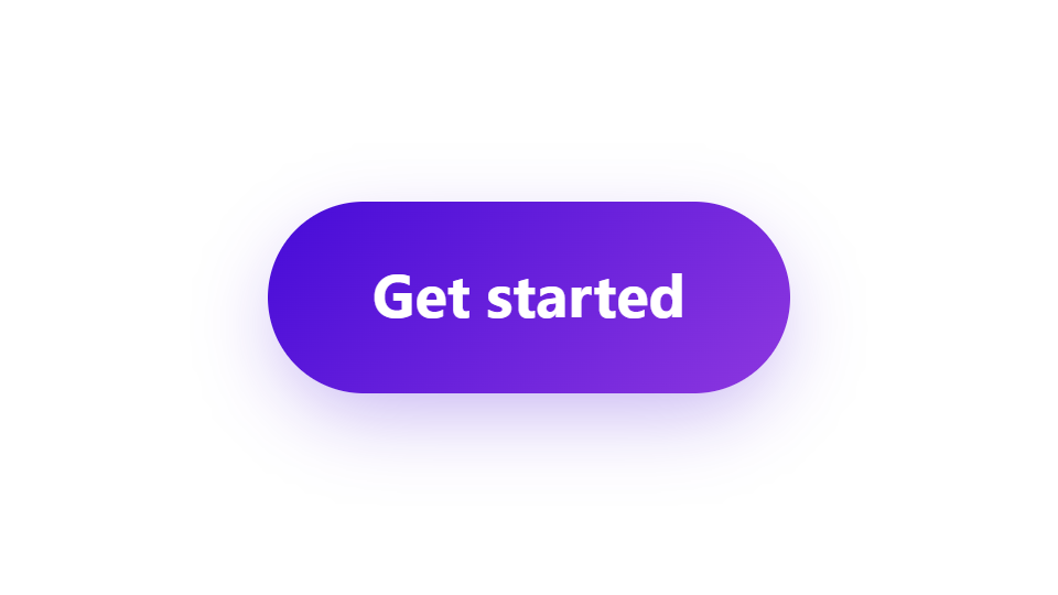

This example uses only the generator’s controls. The images above show actual downloaded stylesheets applied to ordinary HTML buttons, not screenshots of the editor.
Start with Signature
Open the CSS Button Generator. In Presets, choose Signature from the Everyday collection. Set Button text to “Get started”. In the code area, set Class name to cta-button.
A preset replaces the default and hover styles, while your label and class name remain. Choose your starting point before making detailed adjustments.
The class name connects the CSS rules to your HTML button. The generator cleans unsupported characters; use a short, distinctive name to avoid styling unrelated elements.
Create the gradient pill
Keep Editing state on Default. In Text, choose System sans, Font size 18 px, and Weight Bold. Keep the white text color, normal style, centered alignment, and line height 1.4.
In Fill, select Linear gradient. Use the two colors and angle below. Set Horizontal padding to 32 px and Vertical padding to 16 px. In Shape, keep Link all corners enabled and set Corner radius to 100 px. Border width stays 0 px.
In Shadow, keep Box shadow enabled. Use horizontal offset 0 px, vertical offset 8 px, blur 24 px, spread −4 px, color #460BD8, and opacity 32%. Leave Inset shadow and Text shadow off.
Padding changes the space around the text. Corner radius changes the outline. A large radius creates this pill shape without making the label wider.
Give hover its own treatment
Switch Editing state to Hover. In Fill, change Background color to #33099E and Second color to #6D20BF. Keep the gradient angle at 135°. In Shadow, change Vertical offset to 10 px and Blur to 28 px. Leave the other settings unchanged.
Use the canvas Default, Hover, and Active buttons to inspect each state. You can also hover over or press the preview button. Change the canvas between light and dark to review its edge and shadow.
Editing state chooses which styles you change. The canvas state only changes what you preview. Return to Default editing before adjusting the resting appearance.
Hover properties that still match the default follow later default edits. Once you customize a hover property, it stays independent. Recheck both states after changing the base style.
Export and test in your page
Select the CSS tab and use Copy CSS, or choose Download to save cta-button.css. Select the HTML tab and copy the matching button markup. The HTML includes the same class name and a button with type="button".
Add the CSS to your stylesheet, or link the downloaded file from your page. Place the HTML where the button belongs. The two exports work together: an HTML button alone does not include its styling.
Open the page and test its default, hover, keyboard focus, and pressed states. The export includes a focus-visible outline, a small active movement, and a reduced-motion rule. Your surrounding styles and installed fonts can still affect the result.
The generated button is a styled control. Connect its click behavior in your project; use the correct button type when adding it to a form.
cta-button.css
The downloaded filename follows the class name.
Common questions
Do I need a CSS framework?
No. The output is standard CSS plus a plain HTML button. Paste the CSS into your own stylesheet and use the matching class on the button.
Does Download save the HTML too?
Download saves a .css file named after the class. Copy the button markup separately from the HTML tab.
Can I give each corner a different radius?
Yes. In Shape, turn off Link all corners, then set Top left, Top right, Bottom right, and Bottom left independently. This example keeps them linked for a pill shape.
Will my design still be here next time?
The studio tries to save the current draft in this browser’s local storage. It is not an account or cross-device backup. Browser settings, clearing site data, or Reset can remove or replace it, so export work you want to keep.
Is my button uploaded to a server?
The styling preview and CSS/HTML generation run in your browser. The editor does not upload your button text or styling draft to create the export.
Give your next button its own style.
Choose a starting point, adjust the details, and bring the code into your project.